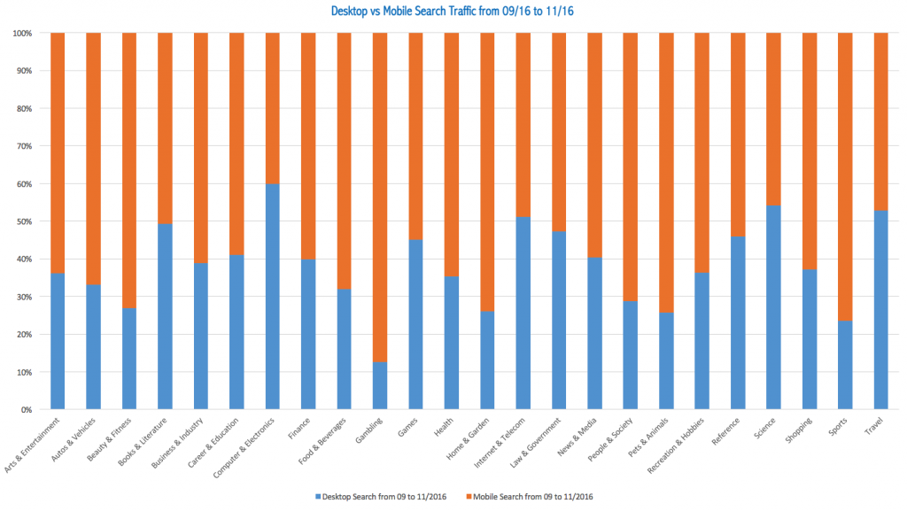
In recent years, there has been a huge shift in internet browsing behaviour, with more people now reaching for their smartphone rather than their computer to browse the net. Voice search is a big influence on this, as its availability is growing on user devices.
Mobile is a growth driver, so it is important for brands not to habitually place their primary focus on desktop, as has been the case in the past. In fact, mobile now represents 65 per cent of digital media time and it is predicted that by the end of 2017, 60 per cent of online shopping traffic will come through mobile. In the first quarter of 2016, this figure was at 45.1 per cent.
Search engines have been acknowledging this shift in user behaviour with their mobile updates over the past two years. Google’s various mobile updates began with ‘Mobilegeddon’ back in May 2015, and have recently included the shift from a desktop index to a mobile index.

Google have stated that 85 per cent of all pages in the mobile search results now meet the mobile-friendly criteria they set.
Now the mobile-friendly labels have been removed, and Google is ready to move on to the next battle, it is again working on optimising the user’s mobile experience with its latest penalty – the mobile intrusive interstitials penalty.
What is the mobile intrusive interstitials penalty?
The mobile intrusive interstitials penalty is also known as the ‘pop-up penalty’, and aims to penalise pages featuring full-screen pop-up ads that are difficult to close, and therefore ruin the mobile search experience. It officially went live on 10th January 2017, and will take a little while to roll out and propagate.
@Marie_Haynes @JohnMu we need to recrawl the web afaik. That takes time
— Gary Illyes ᕕ( ᐛ )ᕗ (@methode) January 17, 2017
Google states that websites will now be penalised if they are:
- Displaying a popup that covers the main content, either immediately after the user navigates to a page from the search results, or while they are looking through the page.
- Displaying a standalone interstitial that the user needs dismiss or engage with before accessing the main content.
- Using a layout where the above-the-fold portion of the page appears similar to a standalone interstitial, but the original content has been in-lined underneath the fold.
Of course, Google will consider interstitials that are conveying a legal message, such as age verification or cookie usage agreement, and these will not be penalised. Nor will mobile websites which opt for less invasive methods of ad display, which is mutually beneficial to both the advertiser and the user. There are much better ways to encourage users to sign up to a mailing list, which don’t involve irritating them by ruining their user experience!
Mobile first, desktop second
This all ties into the shift towards a mobile first search, enforced by the aforementioned search engine updates.
As you will already be aware, Google’s algorithms assess your website on a number of factors that will attribute to your website’s overall ranking. In the past Google’s crawler agent has visited sites for the purpose as assessment as a desktop user agent however, Google has now begun sending mobile user agents instead. In time, Google results pages will be built from these mobile results only.
This mobile first indexation could mean trouble for any website whose mobile version is a slimmed down adaptation of the desktop version, or if your mobile site is simply unresponsive.
Google’s recommendations for mobile first indexation are:
- If you have a responsive or dynamic serving site where the primary content and mark-up is equivalent across mobile and desktop, you shouldn’t have to make any changes.
- If you have a site configuration where the primary content and markup is different across mobile and desktop, you should consider making some changes to your site.
- If you only have a desktop site, Google will continue to index your desktop site just fine, even if it is using a mobile user agent to view your site.
- If you are currently building a mobile version of your site, keep in mind that a functional desktop-oriented site is better than a broken or incomplete mobile version of the site. Launch your mobile site only when it is ready.
- It is important to ensure that the mobile version of your site is verified and submitted via Google Search Console.
Mobile first for 2017
In summary, your focus for 2017 needs to be mobile first, to please both your site users and search engines. With Google and other search engines now determined to optimise the user’s mobile experience, you now need to do the same, if you haven’t already. Any pop-ups you use need to be non-intrusive, or you now face a Google penalty as well as many disgruntled users.
If you would like some help with ensuring your business is mobile first in 2017, just get in touch.
Featured image credit: monti livio

